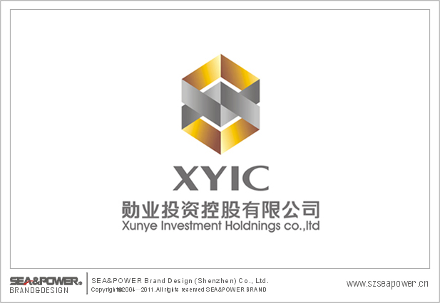
Ʒ�ƴ�����������־�������ּ��������������ѫ�µ�����Ϊ�������ټ��ϡ�ѫ��Ӣ�ĵĵ�һ��ĸ��X��Ϊ����Ԫ�ر仯������������־���ش��ԡ�X���������һ��ѫ�£���־��������ָ�����ݴ�ص�����˷���ȫ��Ԣ�˾δ����չ���鲼ȫ���磬������־�ɡ�X�����ε���϶��ɣ���������ҵͶ���Ƚ������硣�����˹�˾δ��ǰ���ƽ����ԻͲ��á�������־ɫ�������ˣ���ɫ����ɫ��������Ͷ����ҵ��ǿ������ҵ�Ƚ���Ͷ�����������ҵ�������ϵķ�չ���ƣ�����������ʱ���к��ʻ�ɫ�ʡ�
Creativity explanation: The symbol design primary intention lies in entire contour take the medal modelling as a foundation, in addition "merit" English first letter "X" for foundation element change. The entire sign steady is natural, composes a medal by "X" the distortion, symbolized six angles aim at the motherland in all directions (whole world), the implication company future will develop proliferates the world, the entire symbol became by "X" the distortion combination, symbolizes the enterprise to invest the steady attitude. Will manifest company's future future to resemble the brocade magnificently, is bright. The entire symbol luster succinct has been bright, golden color, silver symbol finance investment profession. Emphasized the enterprise steady investment idea, the symbolic enterprise progresses day by day the development tendency, has the bright time feeling and the internationalization color.