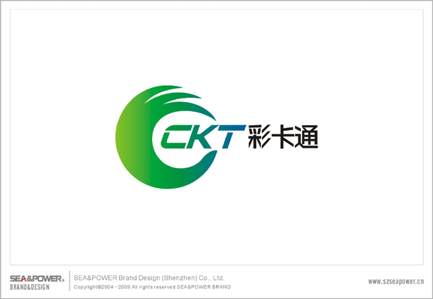
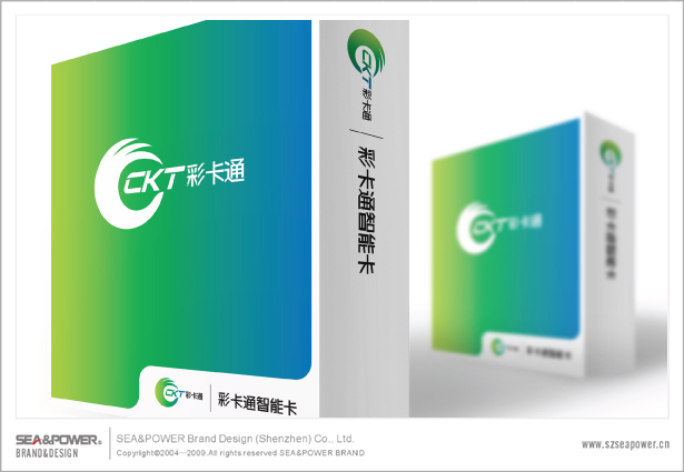
Ʒ����Ʋ��ԣ������ʱ������ҵ��ĺ�����Ϊ�����ͻ��Ĺؼ���Ϊ��Ϊ��Ӫ��ֵ��������Ʒ������������Ҫһ����ͬ�Ŀ�ʶ���Ʒ�Ʊ�ʶ���������ν�ġ�����Ʒ�ơ������������Ϊ���ʿ�ͨ���ܿ�����־����Ʒ������������ʱ�����������ӹ�����ҵ�Ĵ�ͳ���ģʽ�����������ʶ���µĸ���ɫ�ʡ�
��ʶ������ɫ����ɫ��ɫ�ʽ�����ɣ��Լ�Լ��������ɫ�������ڱ����ɫ�Ƽ����ĺ��壬��ʶ��ͼ�β����������־�ĺ��IJ��֣�������һ�֡�OK��֮�⣨��ƷOK������OK������OK��Ч��OK��,�Դﵽ˫Ӯ��Ŀ�ġ�
Brand Design Strategy: At this time, commercial cooperation between the key actors to attract customers, in order to create a trustworthy brand image, we need a common identifiable brand identity, and this is the so-called "business brand." This time for our "CKT" signs to enhance the brand image of the time, breaking the tradition of the past, processing and manufacturing design patterns, giving the image of the feelings of identification with a new color.
Logo green to blue color gradient transition to simple main colors of green blue, is intended to express the "green technology" the meaning of the graphic logo is the core of the logo to express a kind of "OK" means ( Product OK, quality OK, Service OK, effective OK), in order to achieve a win-win objective.